Creating a Chart
This chapter assumes that you already completed this.

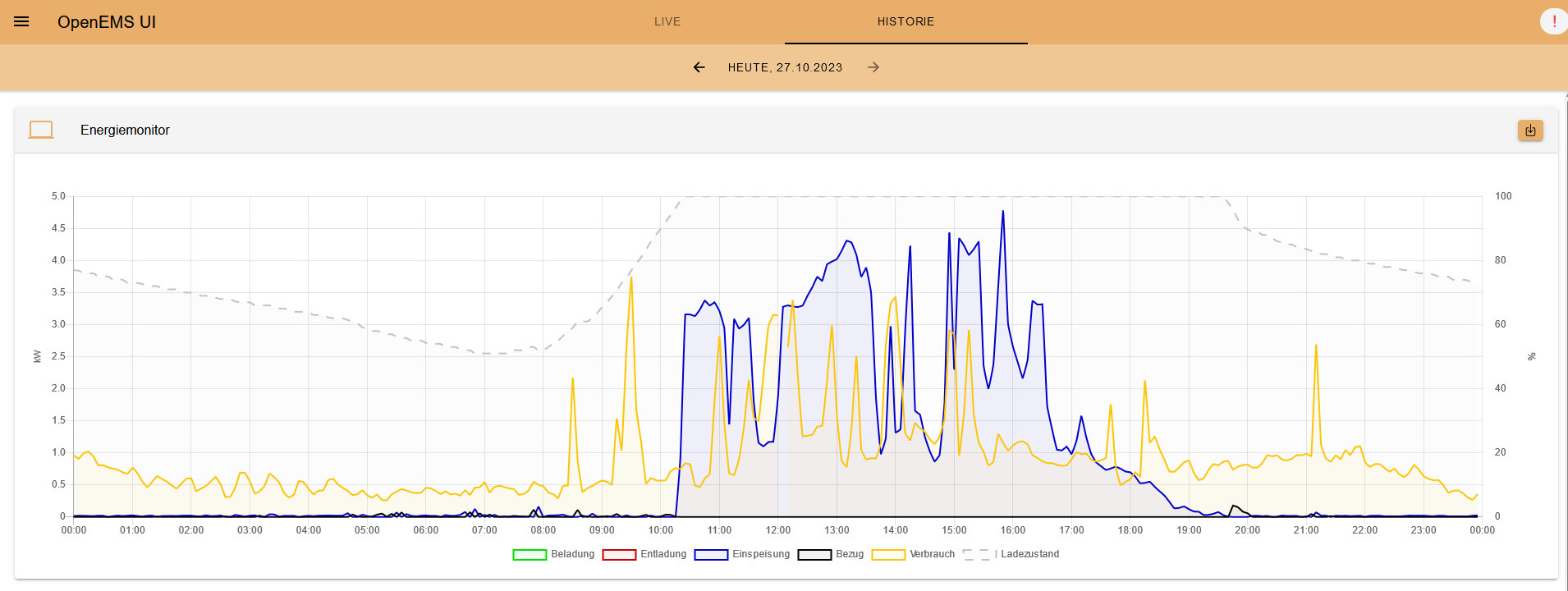
Charts are mainly used in the History-View and should be acting like the modal in the live-view. This means they shouldn’t be apparent in the history-view directly, but should open when clicking on a flat-widget.
Creating or updating charts has been very difficult, but if you use the recommended and new way of creating them, its much easier and can be done fast. Furthermore they are unittestable now.
If we take a look at a Working Example, we will see, that the chart directory includes not only the chart.ts but also the corresponding .spec-file. If you are not familiar with angulars unit testing, check it out here.
It is recommended to have the component.ts and component.spec.ts files in the same folder.
|
General
To understand how data is queried from the timeseries database, you need to know that there are some predefined time ranges modes for the chart.
If you used the charts from time to time, you will notice that there are two visualisations. Bar and line chart. Line charts are used for day and week periods while bar charts are used for months and year. The custom period shows both, dependent on the selected period (view resolution). The resolution, returned from this method is also used in the corresponding Timeseries-Request.
When using the QueryHistoricTimeseriesDataRequest, you should use the power-channels and for the QueryHistoricTimeseriesEnergyPerPeriodRequest the energy-channels. You can read more about that here.
If you take a look here you will notice that creating charts can be broken down to 2 main parts. The input and output.
The input consists of this:
export type InputChannel = {

    /** Must be unique, is used as identifier in {@link ChartData.input} */
    name: string,
    powerChannel: ChannelAddress,
    energyChannel?: ChannelAddress

    /** Choose between predefined converters */
    converter?: (value: number) => number | null,
};
Here you define the channels that should be subscribed, it is mandatory to use a power channel, if no energy channel provided, you won’t see the energy-value next to the legend-label. If no valid datapoint in the resulting data or no response exists, the dataset won’t be shown. You can also pass a converter. This enables mutating the data right away. For this you should either use one of the predefined converters or create your own.
The output callback gets this data and with it, you can define the datasets:
Lets get back to the example.
| When looking at the example when reading the following, it will be easier to follow. |
For the input there are two channel-pairs used, additionally to the second, the data gets filter through a converter which filters in this case all null or negative values.
The name property is used to have a ID for using the data later.
The output is then defining the dataset, with the nameSuffix callback having the data of the QueryHistoricTimeseriesEnergyRequest, that has been called for the whole period, this means only one datapoint for the chosen period. If month or year are used as periods, there are always two of these requests. One for the legend label and the other for being displayed in the chart.
The second one is passed with the output callback, and has to be used for the converter callback-function.
Additionally we define the formatting of the data in the tooltip and the yAxes.